When Wrap’d approached us, they had the best quality food in town. However, the only thing that was lacking in their food was its packaging. We saw an opportunity to create a brand identity that looks and feels visually as fresh and mouthwatering as it tastes. Wrap’d could compete with the best. So we decided to create an identity that triggers appetite at first glance.
The Opportunity
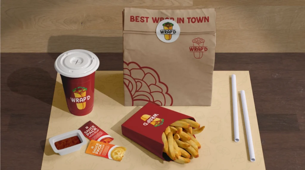
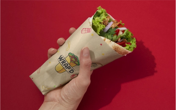
Most food brands underestimate how visuals and packaging influence our hunger. Wrap’d had the food quality, but the branding felt generic and easy to overlook. The opportunity was to design a brand identity that looked fresh, warm, and energetic, visuals that grab attention in seconds. A color palette that triggers cravings and packaging that feels premium.
The Solution
Designing a Visual Identity that looks as Good as it tastes
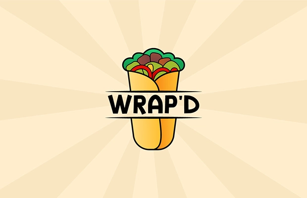
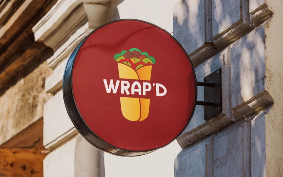
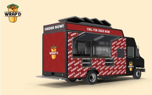
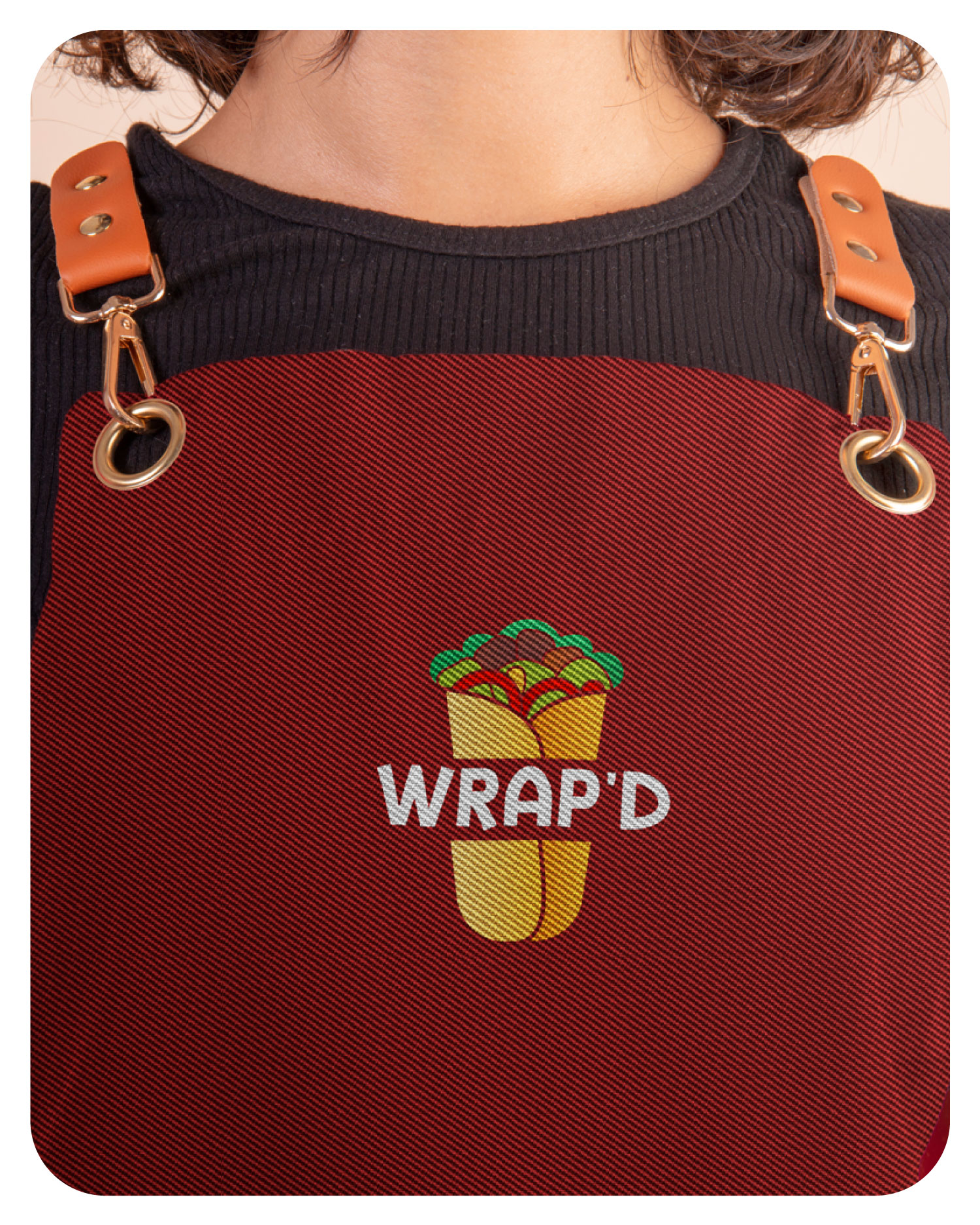
We designed a handcrafted logo that combined a friendly illustration with a wordmark. For the color palette, we used warm yellow, cool red, and mint green; these colors looked like real ingredients. We crafted a brand identity that extended across billboards, food truck graphics, storefront signage, social media visuals, and app icons. So whenever a customer sees Wrap’d online or in-store, they instantly recognize it.

The Result
What changed after the rebrand
The new brand identity gave Wrap’d a social presence that finally matched the quality of their food. The packaging felt so premium that buyers actually photographed and shared it. Now, Wrap’d got the recognition it deserved, and it became a high-conversion brand. When a brand feels right, customer loyalty increases, and they keep coming back.


Need Help? Schedule an Enquiry Call
Why Our Clients Love to Work with Us!

Audrius Stonkus

Maria Sanchez
